
The Merchant Dashboard is the home screen of the Quickvee Merchant Backend. It gives merchants a real-time, single-glance view of business performance across all sales channels — POS, online ordering, and delivery — through eight KPI tiles, an interactive Sales Overview chart, a Top Products list, and a live Recent Orders Activity feed.
Access path: Merchant Backend → Dashboard (landing screen after login)
Each KPI tile is clickable and opens a detailed analytics page with peak hour, peak value, and a Performance Trend graph for that specific metric. The dashboard supports single-store and multi-location views, and can be filtered by Day, Week, or Month with full forward/back navigation.
Header controls
Title
Merchant Dashboard with the subtitle "Real-time insights into your business performance."
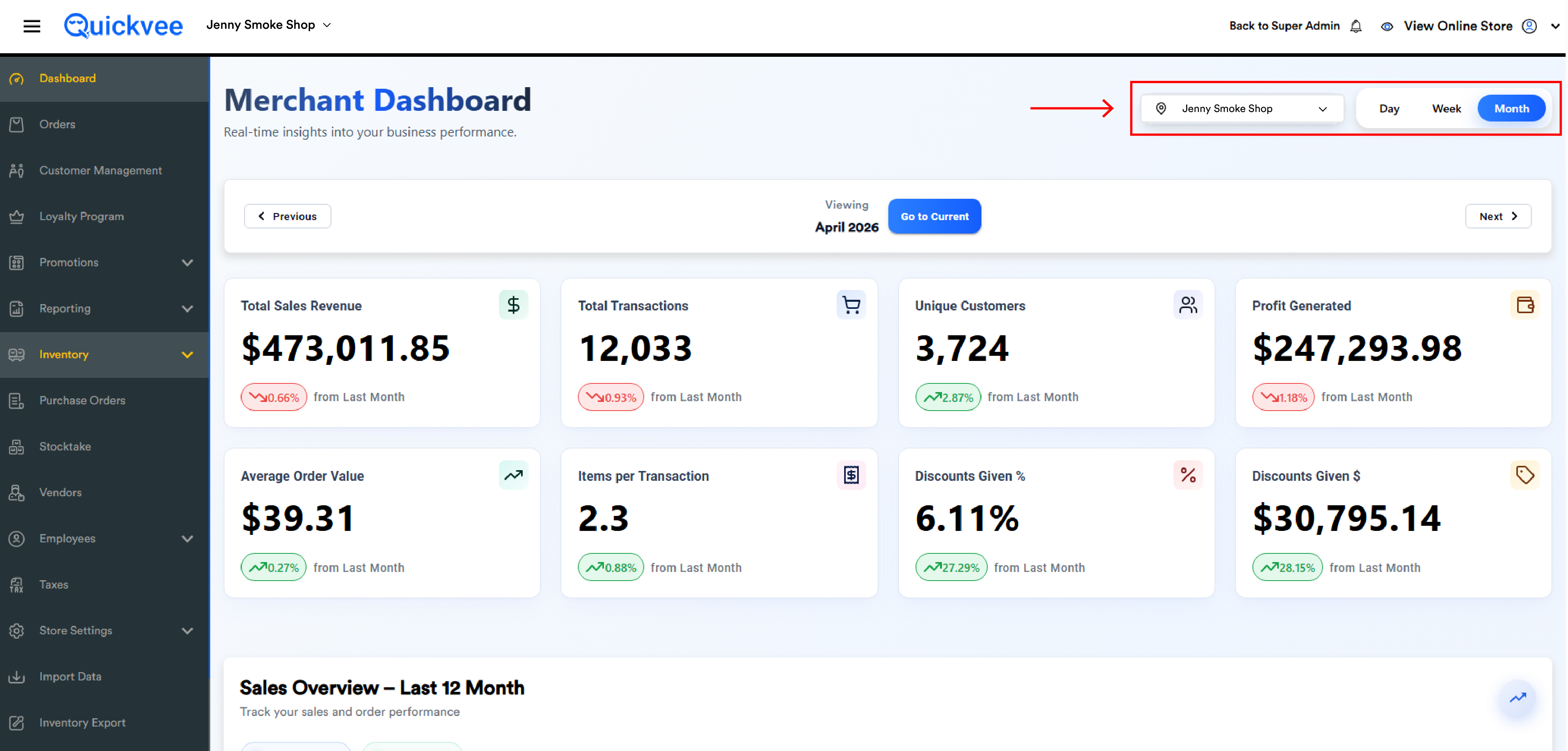
Location selector (top-right)
For multi-location merchants, the location selector dropdown lets you choose which store(s) to view. Single-store merchants see only their store name.
|
Option |
Behavior |
|---|---|
|
All Locations (N) |
Aggregates data across every store |
|
Individual store rows |
Each row shows store name + city/state (e.g. |
|
X of N selected counter + Done |
Confirms the multi-location selection |
Period filter
Three pill buttons: Day, Week, Month. The selected filter is highlighted in blue. All KPI tiles, Sales Overview chart, Top Products, and Recent Orders update to match.
Period navigation bar
|
Element |
Purpose |
|---|---|
|
‹ Previous |
Move the viewing window back one period |
|
Viewing label + selected date |
Centered display of the current period (e.g. |
|
Go to Current |
Jump back to today / this week / this month |
|
Next › |
Move the viewing window forward (disabled if at current period) |
The Day/Week/Month filter and the period navigation work together. Use the filter to choose granularity, then Previous/Next to move through historical periods.
KPI tiles
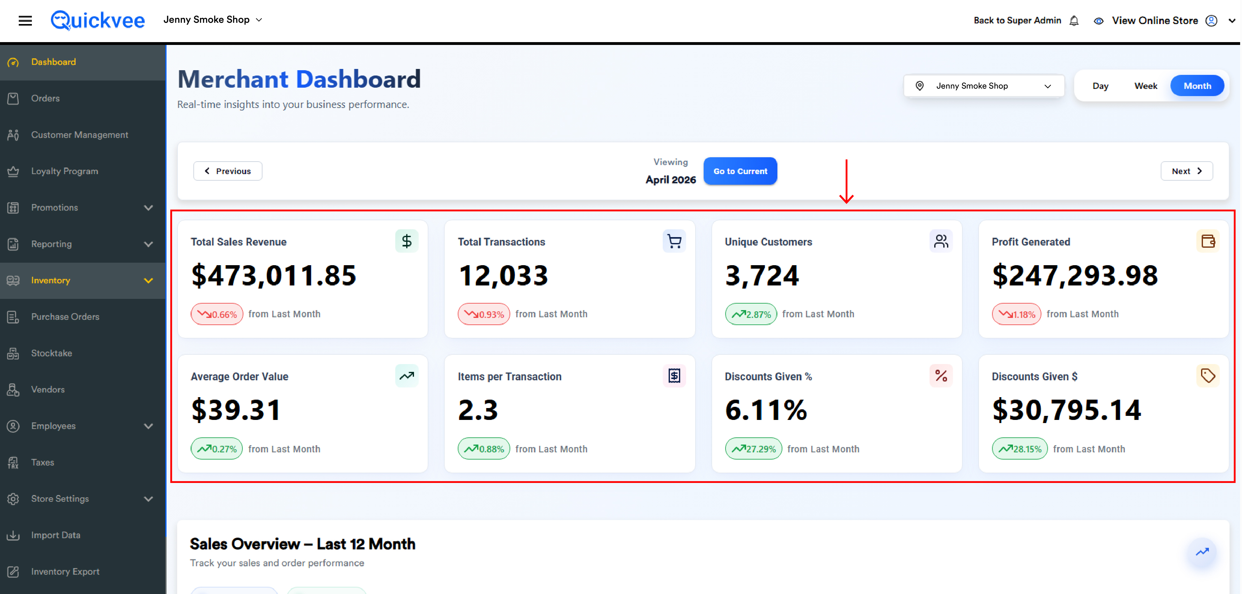
Eight KPI tiles in two rows of four. Each tile displays:
-
Metric label (e.g.
Total Sales Revenue) -
Current value in large bold (e.g.
$4,987.61) -
Change indicator — a colored pill showing the percentage change vs. previous period (e.g.
↘ 68.41% from Yesterdayin red; green for increases) -
Decorative icon in the top-right of the tile
Each tile is clickable and opens a detailed analytics page for that KPI showing Current Value, Peak Hour (or Day/Week/Month), Peak Value, and a full-width Performance Trend chart.
The 8 KPIs
|
# |
KPI |
What it measures |
Format |
|---|---|---|---|
|
1 |
Total Sales Revenue |
Net revenue after discounts, loyalty redemptions, and refunds |
|
|
2 |
Total Transactions |
Net count of paid completed orders, minus fully refunded/voided orders |
|
|
3 |
Unique Customers |
Distinct customers who placed at least one paid order in the period |
|
|
4 |
Profit Generated |
Gross profit — Net Sales minus Cost of Goods Sold (COGS) |
|
|
5 |
Average Order Value |
Sale Revenue divided by Total Transactions |
|
|
6 |
Items per Transaction |
Sale Revenue divided by total items sold |
|
|
7 |
Discounts Given % |
Total discount as a percentage of (discount + revenue) |
|
|
8 |
Discounts Given $ |
Total dollar value of all discounts applied during the period |
|
Trend indicator logic
|
Period Filter |
"Previous Period" Means |
|---|---|
|
Day |
The previous day (label: |
|
Week |
The previous 7-day window (label: |
|
Month |
The previous calendar month (label: |
Red downward arrows indicate a decrease, green upward arrows indicate an increase. Percentage is calculated as ((Current − Previous) / Previous) × 100.
If there's no previous-period data, the trend indicator is hidden. A brand-new store with no prior week of sales will not show a "from Last Week" comparison.
Sales Overview chart
A line chart titled Sales Overview - Today (or - This Week / - This Month based on filter) sits below the KPI tiles. It tracks two metrics:
|
Series |
Color |
What it shows |
|---|---|---|
|
● Sales Revenue |
Blue line |
Revenue trend across hours / days / weeks |
|
● Transactions |
Green line |
Transaction count trend across the same time axis |
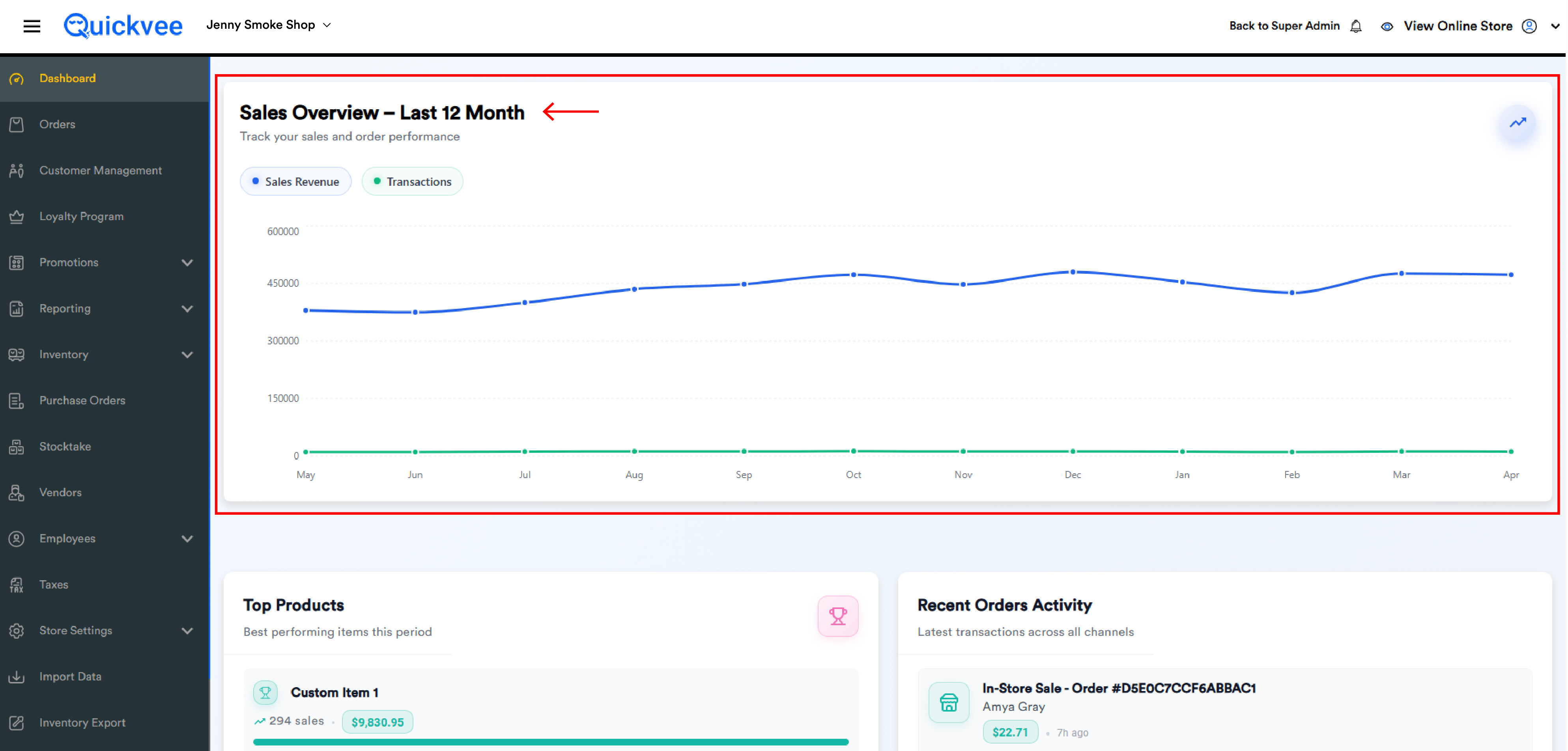
X-axis: time (hours 12 AM → 11 PM for Day, days Mon → Sun for Week, weeks for Month). Y-axis auto-scales to the data range.
Hover over any point on the chart to see the exact value at that time. The chart updates immediately when you change the period filter or location selector.
Top Products panel
Title: Top Products — "Best performing items this period"
Ranked list of highest-selling product variants for the selected period. Each row displays:
-
Trophy icon (color-coded by rank)
-
Product name with variant (e.g.
FRE Nicotine Pouches-Wintergreen/15mg) -
Sales count (e.g.
15 sales) -
Revenue pill (e.g.
$122.56) -
Progress bar showing relative performance vs. the top product
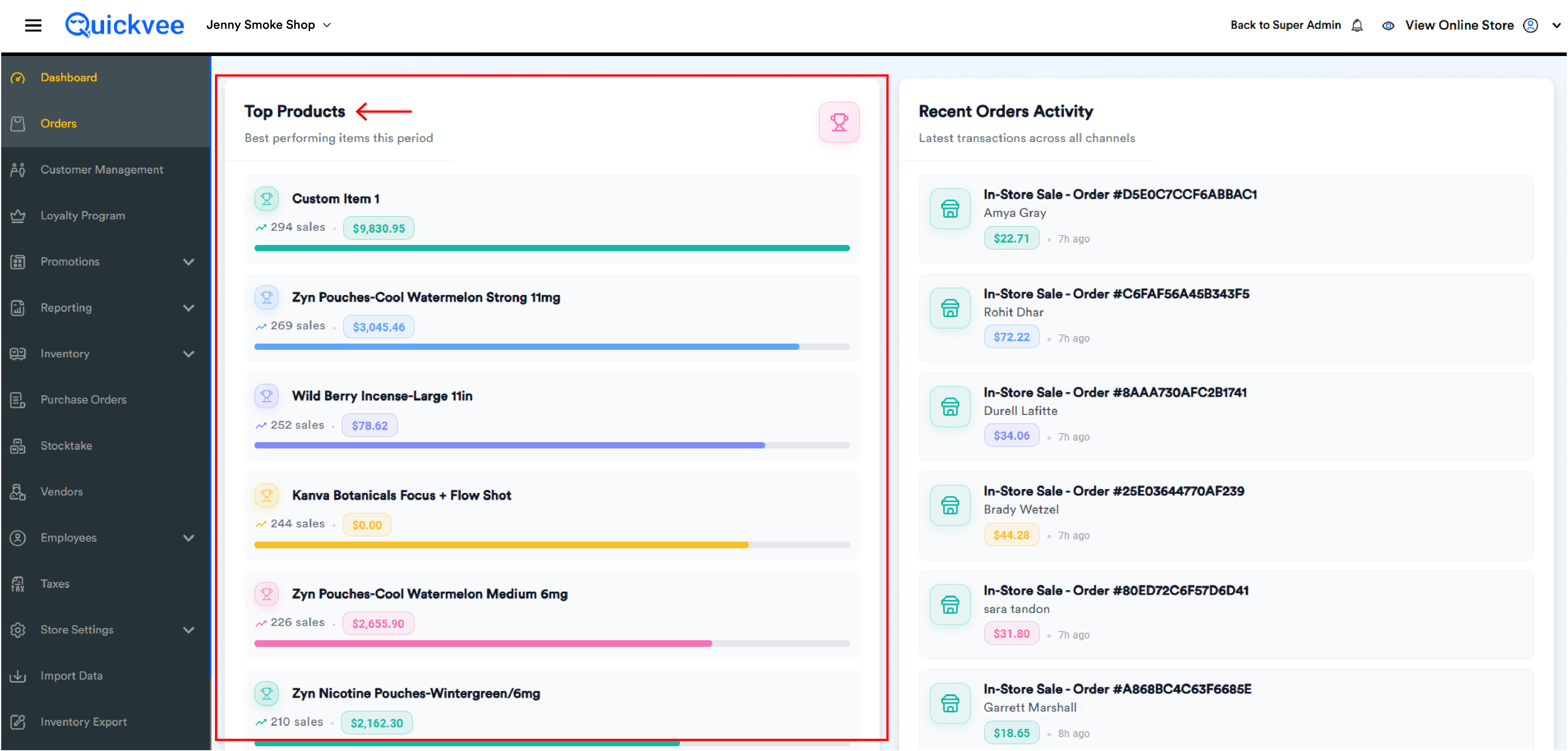
Custom Items (sales rung as one-off items without a product record) appear in this list as Custom Item N.
Recent Orders Activity panel
Title: Recent Orders Activity — "Latest transactions across all channels"
A live feed of the most recent transactions from POS, online, and delivery. Each row shows:
-
Channel icon (e.g. store icon for In-Store Sale)
-
Order type and ID (e.g.
In-Store Sale - Order #D8C2B2FA1ED2CF9B) -
Customer name (or
Walk-in Customer) -
Order amount pill (e.g.
$17.03) -
Time elapsed (e.g.
2m ago,15m ago)
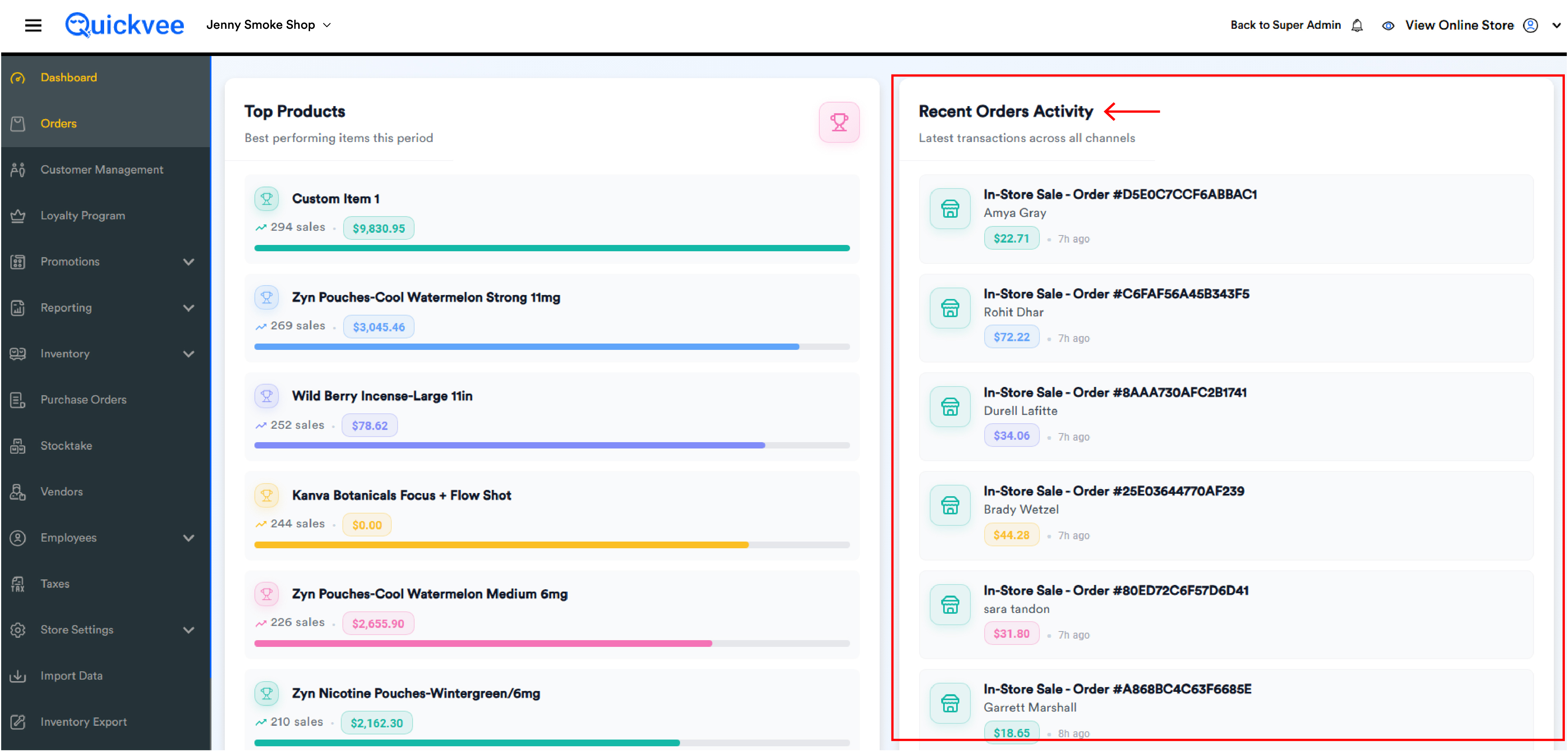
The feed updates in real-time. New orders appear at the top automatically without needing to refresh the page.
Detailed KPI pages
Clicking any KPI tile opens a detailed analytics page. Same layout regardless of which KPI you opened.
Header
-
‹ Back button (returns to the main dashboard)
-
KPI icon (matches the tile's icon)
-
KPI title (e.g.
Total Sales Revenue) -
Subtitle: "Detailed analytics and insights"
Three summary tiles
|
Tile |
Purpose |
|---|---|
|
Current Value |
Same value as on the dashboard tile, with the % change pill vs. previous period |
|
Peak Hour (or Day/Week/Month) |
The single time slot within the period that had the highest value. Each KPI uses a different accent color (green for Sales Revenue, blue for Transactions, purple for Unique Customers, gold for Profit, cyan for AOV, pink for IPT, red for Discount %, orange for Discount $) |
|
Peak Value |
The dollar/count amount achieved at that peak time slot. Subtitle: "Highest recorded point" |
Performance Trend chart
A full-width chart titled Performance Trend shows the selected KPI plotted across the period's time axis. The chart's color matches the KPI accent color.
The Performance Trend graph for Items per Transaction displays as a flat line at zero on days with no qualifying data — this is expected behavior, not a bug.
Decimal precision: Total Sales Revenue, Profit Generated, Average Order Value, and Discounts Given $ display two decimal places with $ prefix. Total Transactions and Unique Customers display whole numbers. Items per Transaction displays two decimals. Discounts Given % displays two decimals with % suffix.
Multi-location behavior
When All Locations or multiple stores are selected:
-
All KPI values are aggregated (summed for revenue/transactions/discounts; deduplicated count for unique customers)
-
Sales Overview chart shows a single combined line across all selected stores
-
Top Products shows highest sellers across the combined inventory
-
Recent Orders Activity shows orders from all selected stores in a single chronological feed
-
Detailed KPI pages also aggregate across the selected stores
Switching the location selector immediately re-computes everything on the dashboard. No page refresh is needed.
Important notes
Real-time updates. The dashboard auto-refreshes as new orders come in. If values appear stale, hard-refreshing (Ctrl+Shift+R / Cmd+Shift+R) forces a full reload.
Refunds and voids reduce KPIs in real time. A refunded order subtracts immediately from Total Sales Revenue, Transactions, Profit Generated, etc. — Discounts Given values are also reduced if the original order had a discount.
COGS accuracy matters for Profit Generated. Profit Generated is only as accurate as the Cost per Unit values on your products. If product costs are out of date or missing, Profit Generated will be unreliable.
Discounts Given includes loyalty redemptions. Loyalty Points used at checkout are counted alongside coupons, BOGO, Mix & Match, and custom item discounts.
Day filter X-axis. Charts show 24 hourly buckets (12 AM → 11 PM). Hours with no activity show as zero.
Week filter day mapping. X-axis represents days of the week (Sunday → Saturday or Monday → Sunday depending on your store's week-start setting).
Month filter granularity. Month view aggregates by week within the month, with four to five weekly buckets depending on calendar length.
Custom Items in Top Products. Sales made as Custom Item (without an inventory record) appear as Custom Item 1, Custom Item 2, etc. They cannot be merged into proper product totals — always sell from inventory where possible.
Walk-in Customers in Recent Orders. When no customer is attached, the row shows Walk-in Customer. Attaching customers at the POS gives you accurate Unique Customer counts and customer-specific reporting.
Mobile responsiveness. The dashboard renders correctly on phones and tablets.
KPI calculation reference
Use these formulas to reconcile dashboard values against the underlying reports.
|
KPI |
Formula |
Example |
|---|---|---|
|
Sale Revenue |
|
$150 subtotal − $20 discounts − $45 refunds = $90 |
|
Sales Count (Net) |
|
— |
|
Customer Count |
Distinct customers who placed at least one paid order in the period |
— |
|
Gross Profit |
|
$50,000 − $32,000 = $18,000 |
|
Average Order Value |
|
$9,000 / 300 = $30 per transaction |
|
Items per Transaction |
|
$9,000 / 1,500 = $6 per item |
|
Total Discount |
|
$50 + $30 + $20 + $10 + $5 = $115 |
|
Discount % |
|
(15 / (15 + 35)) × 100 = 30% |
Discount % uses gross-up logic, not a simple discount / revenue ratio. The denominator includes the discount itself, giving a more conservative percentage.
Note on terminology. Sales Count = transactions/orders. Items Sold = total quantity across all sold products. These are different counts — don't confuse a 5-item order with 5 transactions.